Wednesday, December 22, 2010
A White Sand Christmas
Monday, December 20, 2010
To Women (and Men) of Vision
This was a delightful project. Women of Vision is a volunteer ministry of World Vision, a Christian relief and development organization, which equips women to serve impoverished and oppressed women and children worldwide. WoV seeks to educate and inspire women to action in an effort to alleviate the injustice and inequities that exist for women and their families.

Wednesday, December 15, 2010
A Room of One's Own
 The perks of sub-letting from a cabinet guy is the room is full of gorgeous wood - floor runners, a huge wall-mounted desk, beautiful shutters, and the thing that sold me on the place, the door. That and the 5 minute walk along the river that is now my daily commute.
Within a week, I was moving in and I have to say, I have never had so much space exclusively my own! 170 sq ft is not even that much as far as studio space goes, but just sitting in a corner of the room and looking at all the empty space even after all my equipment was set up felt like my mind was about to expand out of my head and attempt to fill at the little corners of creativity. Virginia Woolf had an insight which I am beginning to understand on a new level.

- Since I'm paying for the space, I'm motivated to be efficient and make good use of it. It is also an investment in myself and my work. I believe I can make work worthy of the money I spend to create it. And I believe that there are clients and investors out there that will recognize the value of that work and help me (eventually) turn a profit.
- I'm surrounded by other people working. Well, only two other people, but having a working 'energy' present instead of fighting with the home 'energy' of cooking, cleaning, relaxing, sleeping shows up in my productivity.
- Home is now home and ideally when I'm there, I can drop that ever-present nagging in the back of my mind that I should always being doing one more thing. It's something many of us self-employed people struggle with. I expect it will be an adjustment to not think of something I need to do after dinner and jumping up and doing it. But I am looking forward to spending more time with my wonderful husband, reading books, watching movies, sharing our home with friends, knowing that my studio awaits me in the morning.
Sunday, December 5, 2010
Basalt Blizzard
A very merry Yuletide from the Roaring Fork Community! This weekend was the annual YuleFest, an art and food fair benefitting Basalt High School, here in our new home. To join in the fun, I set up an Animation Station – a booth where anyone could stop by and spend a few minutes creating stopmotion. It was a great hit. Over the course of the day, about 50 people contributed to one continuous film and we ended up with over 2 minutes of animation! It was a fantastic way to pull people out of shopping mode and allow them to contribute to a project bigger than any one person. Now that’s true Yuletide spirit!
Our wintery theme was the Basalt Blizzard. The process was simple: visitors could either create their own snowflake to add to the blizzard or use one of the ones I had made.
Most of the adults were a little intimidated by the crafts and opted to use the provided materials, but the kids loved cutting and decorating their own snowflakes!


All the donations from the project went directly to the Basalt H.S. Leadership fund which sponsors clubs and activities at the school. Thanks to everyone who stopped by and I hope to see you again!
Friday, December 3, 2010
Yule Fest 2010 -The Animation Station
Monday, October 18, 2010
Sunset Animation
Wednesday, October 6, 2010
10/10/10 Animating away the climate crisis
In a few days, people in 187 countries will gather at 6,391 individual events to make the world a better place. 10/10/10 has been designated a Global Work Party towards climate solutions. The event is spearheaded by the growing 350.org movement. Read this to find out why 350 is the most important number on the planet.
Thom and I got a head start on our own little project – some plein air (i.e. out in the fresh air) animation right in our backyard. Here is the result of a pleasant afternoon on the banks of the mighty Clutha River, which flows from Lake Wanaka and holds the largest catchment in New Zealand. We decided to bring the sea to the mountains, by using shells we collected on our trip to Port Chalmers and combining them with natural elements we found on the river bank at spring flood. As the sea rises to the river, so the river will bring our material back to the sea. It took 3 hours to create the 450 photographs which make the animation!
A challenge to all musicians and sound artists out there: Join the party on 10/10/10 by recording a soundtrack for this little film! Send us your 54 second sound clip and we’ll match it to the video and repost. More details here...
Monday, September 27, 2010
New work in the reel world!
Monday, September 13, 2010
Shelly
Thursday, August 5, 2010
Upcoming Photography Lecture!
If you are in Wanaka, take note! I’ll be presenting some of my work to the Wanaka Photography Club this Monday, August 9 at 7:30pm. 
Wednesday, August 4, 2010
Promoting Good Animation: Accumulonimbus
Accumulonimbus from andy kennedy on Vimeo.
It's great when you see an animated film that could not have been done in any other medium than the one chosen. This is pretty awesome use of clay, bringing together the sculpting craft of an Aardman or Vinton with rhythm and repetition of the masters of abstraction. Watch it big if you can and revel in the details! Thanks to Tiny Inventions for tweeting this so I could find it!
Wednesday, July 7, 2010
Promoting Good Animation! New work from BLU
Sunday, July 4, 2010
Notes from the Animation Workshop at NZMFF
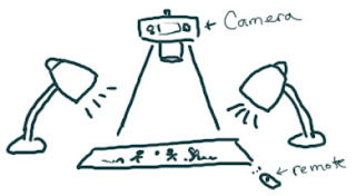
Paper Shredders from Rocky Mountain Sherpas on Vimeo.
Thursday, July 1, 2010
Animation Secrets revealed at NZMFF
Monday, June 21, 2010
A response to the Producers' Dilemma
Friday, June 11, 2010
World of Color Opens Today!
Tuesday, June 8, 2010
A World of Color, with a bit of sand animation too!

June 11th, a new evening spectacular will premier at Disney's California Adventure Park. World of Color is a light, water and music extravaganza, staged on a pool the size of a football feild. If you have ever seen the Belaggio Fountains of Las Vegas, extrapolate that out 300 times and you might come close to what Disney is aiming for here. The fountains are choreographed to music recorded by the London Philharmonic and animation being projected onto the largest mist screen in the world. That's where I come in. I collaborated with the imagineers to create some sand animation during the Aladdin segment of the 25 minute show. It's a very short segment, so don't blink, but I think the idea of projecting sand animation on a water screen is just sorta neat.

A Whale Tale
You can read the story books online and find out more about the fantastic kids programs at Cardrona on their website.
Monday, May 24, 2010
Promoting Good Animation!
Another unusual piece by Hettie Griffiths is Cardif Viral
SCINTILLATION from Xavier Chassaing. This one, I can't quite figure out: But it is pretty cool to watch!
"Nude" a music video by Dancing Diablo. Some unusual paint-on-glass techniques combined with stopmotion. Note how smooth and slow the magnifying glasses move. That's not easy to do!
Want to see even more? You can see my whole list of favorites from the evening on Twitter!
Sunday, May 16, 2010
"Conversing" is up on snagfilms.com
Tuesday, May 11, 2010

Saturday, April 24, 2010
Wednesday, April 14, 2010
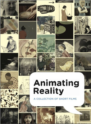 At long last, "Conversing with Aotearoa/New Zealand" is officially out on dvd. And not only do you get a copy of this great documentary on the kiwi wilderness experience, you get 12 other films from around the world as well!
Tuesday, March 23, 2010
Three Things
 Faith
Faith Faith is in you whenever you look
At a dewdrop or a floating leaf
And know that they are because they have to be.
Even if you close your eyes and dream up things
The world will remain as it has always been
And the leaf will be carried by the waters of the river.
You have faith also when you hurt your foot
Against a sharp rock and you know
That rocks are here to hurt our feet.
See the long shadow that is cast by the tree?
We and the flowers throw shadows on the earth.
What has no shadow has no strength to live.
Hope
Hope is with you when you believe
The earth is not a dream but living flesh,
That sight, touch, and hearing do not lie,
That all things you have ever seen here
Are like a garden looked at from a gate.
You cannot enter. But you're sure it's there.
Could we but look more clearly and wisely
We might discover somewhere in the garden
A strange new flower and an unnamed star.
Some people say we should not trust our eyes,
That there is nothing, just a seeming,
These are the ones who have no hope.
They think that the moment we turn away,
The world, behind our backs, ceases to exist,
As if snatched up by the hands of thieves.
Love
Love means to learn to look at yourself
The way one looks at distant things
For you are only one thing among many.
And whoever sees that way heals his heart,
Without knowing it, from various ills-
A bird and a tree say to him: Friend.
Then he wants to use himself and things
So that they stand in the glow of ripeness.
It doesn't matter whether he knows what he serves:
Who serves best doesn't always understand.
Sunday, March 14, 2010
FAST Conference Talk: Animation in the Media
Anyone who has sat down in front of the TV, movie theater or internet recently cannot fail to notice the prevalence of animation. Animation is coming into its own; there is hardly a TV commercial that doesn’t incorporate some sort of animation. Digital technology had made animation easier and inexpensive to create – anyone with a digital camera and a basic move making program on their computer cans move things around and take some pictures (or frames as we call them) and string them together into animation.
Because of this, filmmakers and especially documentary filmmakers are realizing just how important it is to include the visual feast that is animation into their productions, or create entire productions with animation. This goes beyond the typical scientific and informational visualization (animated graphs, medical and chemical illustrations, textbook images that move) with which we are all familiar and are very straightforward in their presentation of information. Below are several animated films that use the technique to drive home a theme or message that would be very difficult to do with live action.
Creating an emotional atmosphere
His Mother’s Voice
by Dennis Tupicoff
Illustrating an emotional or mental state
Ryan
by Chris Landreth
 An interview with Ryan Larkin, a promising young animator who destroyed his career through alcohol and drug abuse To visualize the effect of heroin eating away at a creative mind, Landreth creates a character whose face is disintegrating as he speaks, and yet there are sparks of brilliance still hanging by a thread. If you were to look at Ryan in live action, he would seem a sloppy, drug addict who can barely put together a sentence. But in visualizing him this way, the dignity of who is was in the past comes through the shell of the man he is now.
Using Humor to capture an audiece

The Meatrix
Leo, Chickity and Moopheous discover the true reality behind what we eat. Free range studios and Grace Studios ride the wave of the popular Matrix films to convey the unethical and unhealthy aspect f the commercial meat industry. A clever spoof, a well written script and a highly accessible web distribution plan created a buzz around this film reaching an audience far more extensive than the typical festival goers.
 Animating the past
Persepolis
by Marjane Satrapi
An autobiographical coming-of-age story of a precocious and outspoken young Iranian girl that begins during the Islamic Revolution. The memory of the past is brought to life with character and humor and the comic book graphics not only provide a visual feast, but are able to put us in the experience of the child as she becomes a woman.
 Dealing with graphic subject matter
Waltz with Bashir
by Ari Folman
After a conversation with an old friend, Ari Folman realizes that he can’t remember his experiences on an Israeli Army mission in the first Lebanon War of the early eighties. As Ari delves deeper and deeper into the mystery, his memory begins to creep up in surreal images …
Again, dealing with memory, but trying to present the graphic horror of war without turning the audience away. Graphic images are more palatable (and more emotional) when they are drawn rather than live action. At the end of the film there is about 3 minutes of newsreel footage that shows the carnage of the Lebanon massacre and honestly it turns your stomach. It brings the audience into reality right at the end for an overwhelming impact.
Dealing with shy subjects and overcoming audience stereotypes
Survivors
by Sheila Sofian
 With powerfully understated empathy, Sofian combines voice-over interviews with battered women, and a counselor who works with "recovering" male batterers, with elegant animation to explore the experience of domestic violence from all sides.
Many of the women in this film did not want to be videotaped because they feared for their safety. However, they were willing to have their voice recorded. Unless you are a trained actor, it is impossible to ignore a camera in you face, but a microphone and a conversation can bypass that shyness and subjects are more likely to open up quickly. Additionally, having only the voice as information about a person allows the audience to put themselves in the subject’s place. When we are looking at video of another person, immediately we are judging them on their appearance. With no image to feed our stereotypes, we are forces to listen to the word spoken.
These are just a few examples of animation used in documentary and memoir. Animation is quickly developing into a distinct visual dialect and filmmakers will do well to verse themselves gain some level of fluency in this powerful medium.
Saturday, March 6, 2010
Promoting Good Animation: Bored to Death Intro
A particularly creative intro for a tv series directed by Tom Barham of Curious Pictures. I highly recommend watching it in HD (click here), as the type and expressions of the characters don't show up very well on smaller YouTube. Here's a link to a short interview with Tom Barham.
What makes a good title sequence? In addition to presenting the relevant information (i.e. above the line credits) it should visually tell the story of the film/show it is introducing (without giving too much away, of course!) I haven't seen Bored to Death, but from what I've read of the series and the way Barham approached this intro, it seems he was spot on!
Tuesday, March 2, 2010
Patricia Zohn on Walt Disney Animators Culture: vanityfair.com
Patricia Zohn on Walt Disney Animators Culture: vanityfair.com
Witness
WITNESS
Sometimes the mountain
is hidden from me in veils
of cloud, sometimes
I am hidden from the mountain
in veils of inattention, apathy, fatigue,
when I forget or refuse to go
down to the shore or a few yards
up the road, on a clear day,
to reconfirm
that witnessing presence.
Thursday, February 25, 2010
Context Matters

But most remarkable and provoking to me was a corner of the NGA's East Wing (I love the East Wing!) called the Tower. A spiral stair leading up to this single, square room with high skylights diffusing natural light throughout the space is one of my favorite places to find treasures. Currently, hanging on the walls are 9 large paintings by Mark Rothko, commissioned in 1964 for a non-denominational chapel in Houston, TX, a place of contemplation. The paintings are black, and shades of black - a color Rothko felt affinity towards at this late stage of his life for reasons still debated. Being surrounded by ther 6-foot black canvases covered with Rothko's shadowy, enigmatic brushwork in this small space brought on a variety of feelings. The paintings were paired with a recording of music by Morton Feldman a friend of Rothko's who composed Rothko Chapel specifically for the chapel after the artist's death in 1970. The exhibit incited a somber air of contemplation, a momento mori, which, even as it was created, was swallowed by the museum around me; an older couple reading aloud bits of the interpretations, a group of school kids filtering down the stairs, a security guard pacing the perimeter of the room. I felt drawn to sit and let the blackness swallow me from all angles as Feldman's music struggled submerged beneath the museum ambiance like a small child in a pool who has lost his grip on his inflatable raft and flounders after it with his face barely above the surface. I sat there for probably about 3 minutes, wanting to let the tones of blackness come out of the paintings and swallow me into a shadowy world, wanting to put my hands out in that cloud of darkness, take hesitant steps like a blind woman hoping for my hands to come into contact with something solid, wanting a light to pierce the darkness as the choral notes swelled briefly and in that moment catch a glimpse of the dazzling back of God retreating into the cloud. For 3 minutes, these things passed through my mind, along with the steady steps of the security guard, the voices of new visitors ascending the stairs, the train I had to catch to the airport, before I felt and obeyed the urge to move. As I descended the tower, I wondered how much longer I would have stayed had I been in that chapel in Texas, contemplating the things of the Spirit with these dark mysteries surrounding me and the echoes of thousands of other contemplations from all the chapel's past visitors resonating with the suspended notes of Feldman's composition.
More about the exhibit here
Wednesday, February 17, 2010
Ebert's 10 best Animated Films of 2009

10 years ago who would have thought that there would even be 10 animated feature produced in 1 year. Roger Ebert's list of the year's 10-best animated films, give you a taste of how the industry had changed. Several of these films showcase animation by independent filmmakers - notably Nina Paley's Sita Sings the Blues and Ari Folman's Waltz with Bashir - defying the public conception of animation as Disney or Pixar - though both studios have made the list!
Alas, I have only seen 3 of the 10 thus far. Movie night, anyone?
Sunday, January 31, 2010
Sand Art or Sand Animation?
 Sand animation has almost become a household word ever since Kseniya Simonova's winning performance hit the million view mark on Youtube. It is a riveting performance, set to epic music, telling a culturally charged story through the progressive live transformation of sand on a light table. I think a great part of the appeal is watching this beautiful, stoic young woman passionately throwing sand on the surface by the handful and making grand sweeping gestures that transform abstract shapes into something remarkably recognizable. We are watching an artist at work, and get a glimpse into the mystery of something we could never conceive of doing ourselves.
But is it sand animation? I suppose if we take the root definition of animation as "breathing life into something" we could argue that Simonova is bringing the sand to some semi-lifelike state of being through her careful movements. There is, certainly some spark of life in a Vermeer painting or a Michelangelo sculpture, so why not a sand painting? But epic music and sweeping gestures aside, when I look at those drawings my first thought is, "Wow, that would be really cool if it started moving!" Animation is the frame-by-frame infusion of life into anything (drawings, clay, objects and, yes, even sand) resulting in something seemingly independent of its creator. Simonova's creations are never detached from her. They are dependent on her presence for their transformative life, whereas a true sand animation can life and act effectively without the audience having any awareness of the animator. So, as an animator, and specifically one who has worked in sand, I take issue with the term animation being applied to Simonova's (and other less famous sand artists') admirable but static performance art.

So, to set the record straight, I offer up a few sand animations which effectively use the medium of sand to create vibrant, memorable films.
Of all sand animators, Caroline Leaf is probably the most well-known. Her 1974 adaptation of the Inuit legend "The Owl Who Married a Goose" might be the definitive black and white sand animation. Leaf's seamless switching between of positive and negative space and fluid transformations emphasize the strengths of sand as an animation medium.
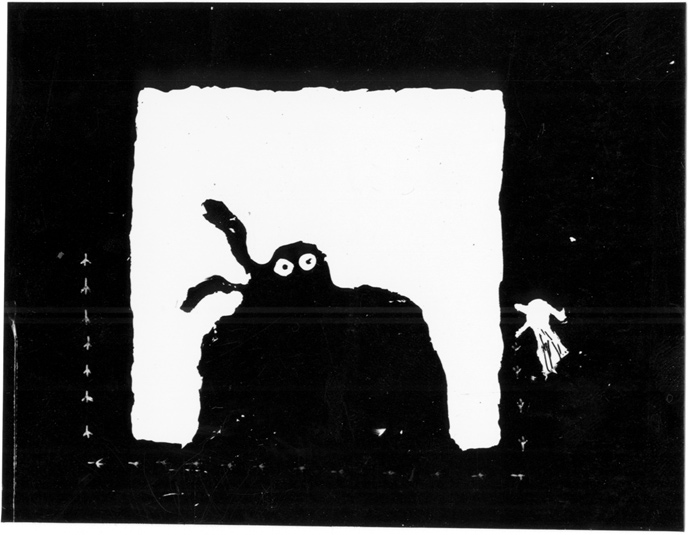 Another classic that you will be hard pressed to find is Bitzbutz by Gil Alkabetz of Israel. Actually, I think he may have used salt instead of sand, but it's the same concept. Good luck trying to get a copy of this one. Thank goodness for youtube, which lets us all enjoy these films!
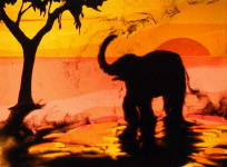 And finally, and most humbly, I offer up Tracks, a sand animation by yours truly. While most sand animation is black and white, I introduced color into the background by using collages made from theater gels which kept the brightness of the pure light behind the silhoueteted sand while adding the vibrancy of color.
Postmodern At Bedtime | The New Republic
 A post-internet generation of children books are emerging with David Wiesner's The Three Pigs at the forefront. Here children construct their own mental narratives, reading with non-linear participating in co-creation. It creates a surprising mental journey, but has something essential been lost in the process?
Postmodern At Bedtime | The New Republic
What do you think?
Wednesday, January 6, 2010
A Sandy Evening
More from the sandbox. When I made "Tracks" I was shooting everything on 16mm and there wasn't much room for play. Now I am trying find some new ways to work with sand using modern technology. I want to keep the look of sand animation, but make the process faster and push the potential further with color and compositing.
Saturday, January 2, 2010
The DEP
Possibly the most influential mentor I've had, at least in my formative years as an animator, was David Ehrlich. David is an independent animator, and artist and a creative collaborator who cross-pollinates with scientists, sociologists, mathematicians and pretty much anyone he comes in contact with at Dartmouth College and beyond. I met him my freshman year and he directed me into independent and experimental work over the next four years. This last fall was his final quarter at Dartmouth before he retires into a new era of teaching and creating in China!
I am not the only one who has been influenced, as is evidenced by the overwhelming response of Dartmouth alumni to collaborate on the David Ehrlich Project. Some of David's past students have gone on to work in the film and animation industry. others haven't pick up a drawing pencil since they last pulled an all-nighter to pass his class. Nevertheless, 18 of us put together an exquisite corpse of animation in honor of David. I started off the film with the volcano and the little orange umbrella. The full list of credits can be found here.


